When I was offered the chance to thoroughly explore almost the entire current line of Tudor Ranger models, I immediately agreed.
GADA (go anywhere, do anything) watches are my favorite category, and I highly regard the Tudor brand. Naturally, I was curious to see how Tudor interprets this genre. However, as it turned out, I am not entirely convinced by these watches. Let me explain.
Key Features of the Tudor Ranger
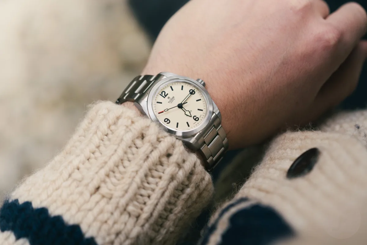
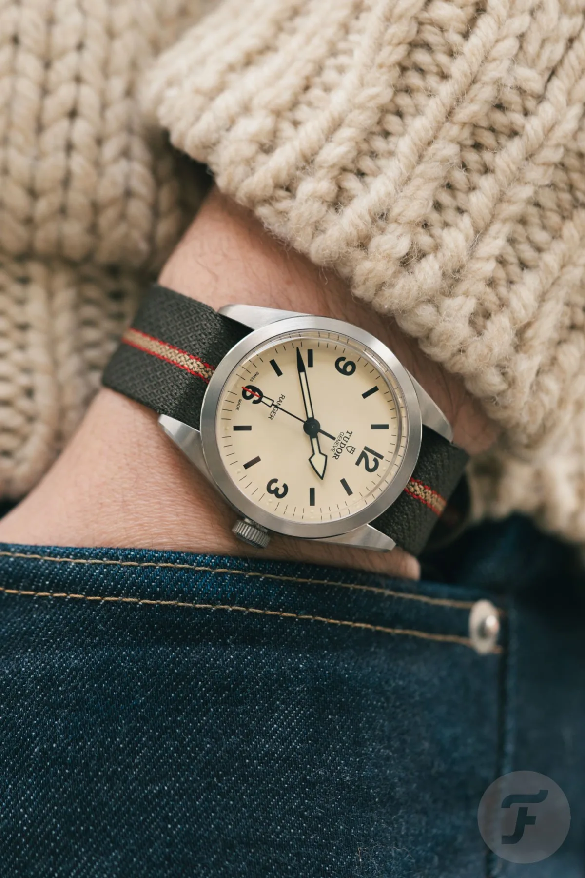
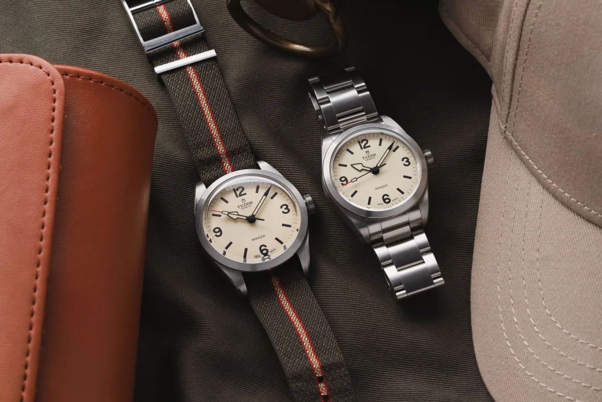
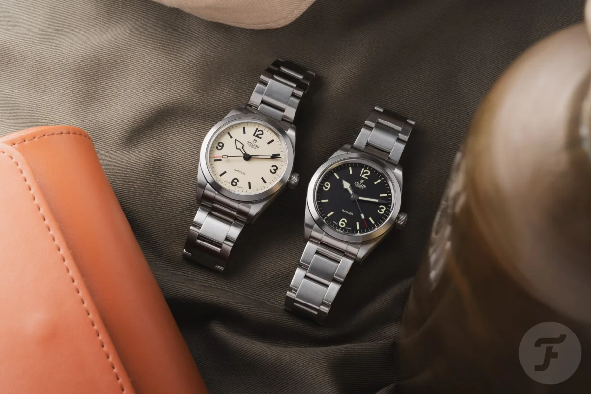
Before diving into the details, it's worth outlining the basic points. I spent time with the beige-dial Ranger in both sizes (36mm and 39mm), as well as the smaller model with a black dial. The 36mm models on a steel bracelet are priced at €3,520, while the 39mm on a fabric strap costs €3,290. Although this is the entry-level for Tudor watches with in-house movements, the price requires critical analysis. Let's get started!
Technical Specifications of the Tudor Ranger
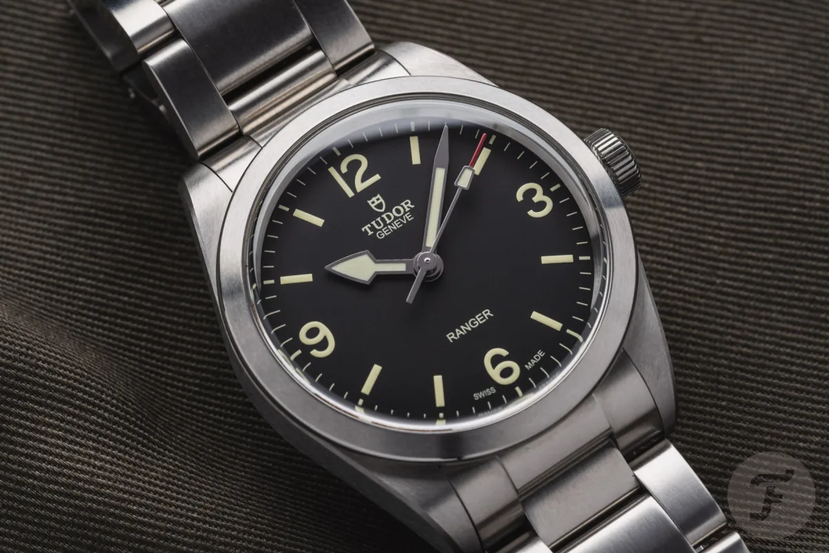
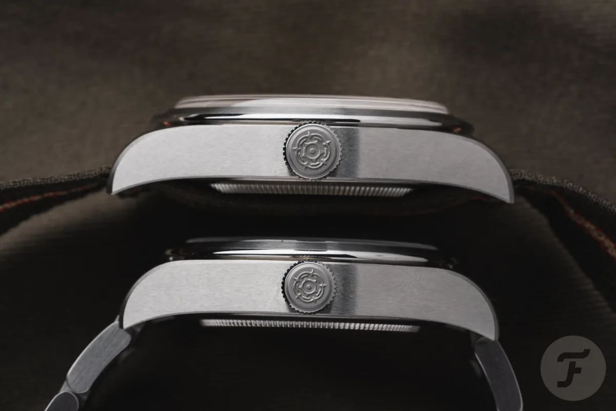
At its core, these are steel GADA/field watches, inspired by the Rolex Explorer. Tudor has a long history in this segment, and the new models heavily rely on historical references, such as the Ranger ref. 7995. The modern Ranger is available in two sizes: 36mm and 39mm. The new 36mm version has a length of 44mm, a thickness of 11mm, and a lug width of 19mm. The 39mm model features a lug-to-lug distance of 47mm and a thickness of 12mm. The 1mm increase in thickness is due to the more domed sapphire crystal. This version also has a standard lug width of 20mm. Both variants offer water resistance up to 100 meters.
Inside the 36mm model is the Kenissi-made in-house caliber MT5400. The 39mm version houses the caliber MT5402, identical in characteristics but adapted for the larger case. Both movements operate at a frequency of 28,800 vibrations per hour, have a power reserve of 70 hours, accuracy of -2/+4 seconds per day, and an anti-magnetic balance spring. Both calibers are COSC-certified chronometers.
The watches are available with a choice of a steel bracelet or a green fabric strap with a distinctive stripe down the center. The bracelet is equipped with a Tudor T-fit clasp with spring micro-adjustment, but without a quick-release mechanism.
36mm Model on an 18cm Wrist
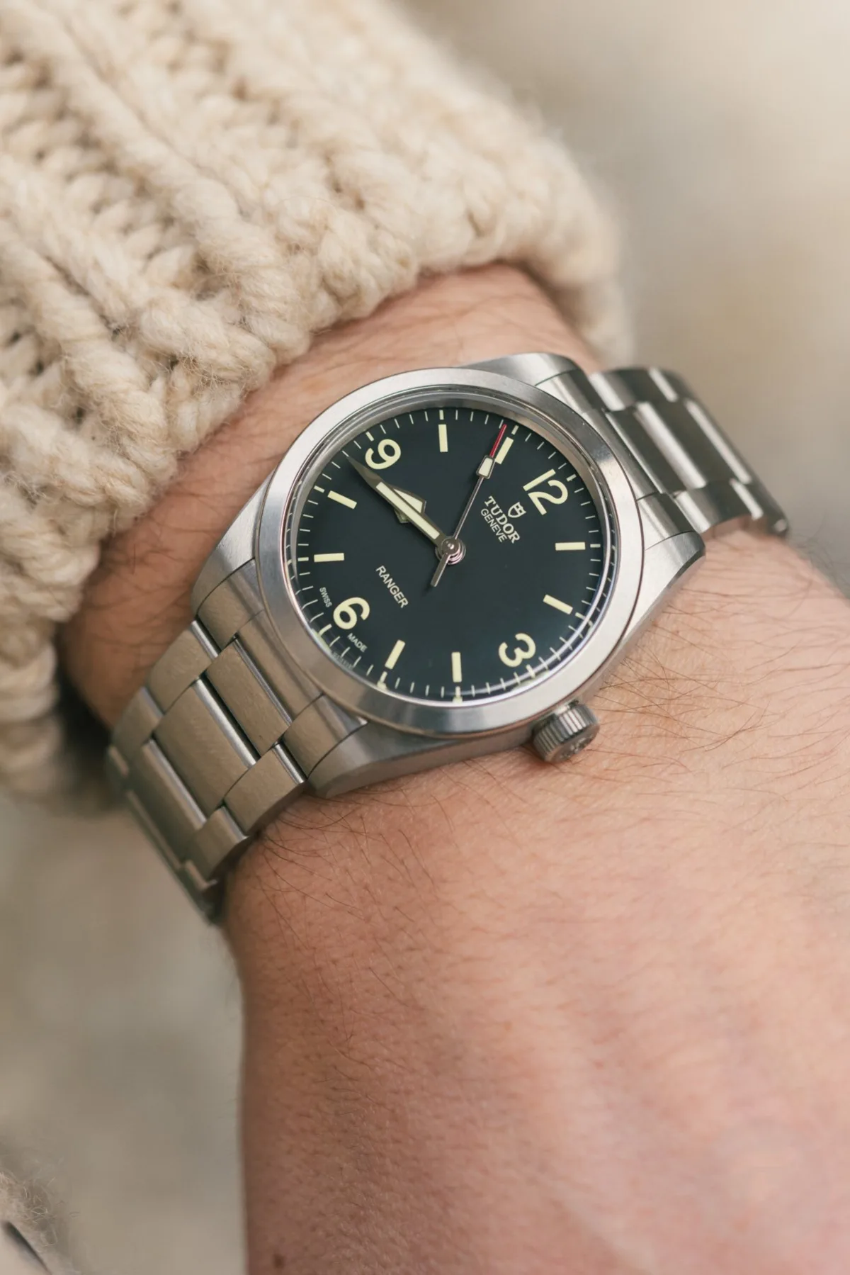
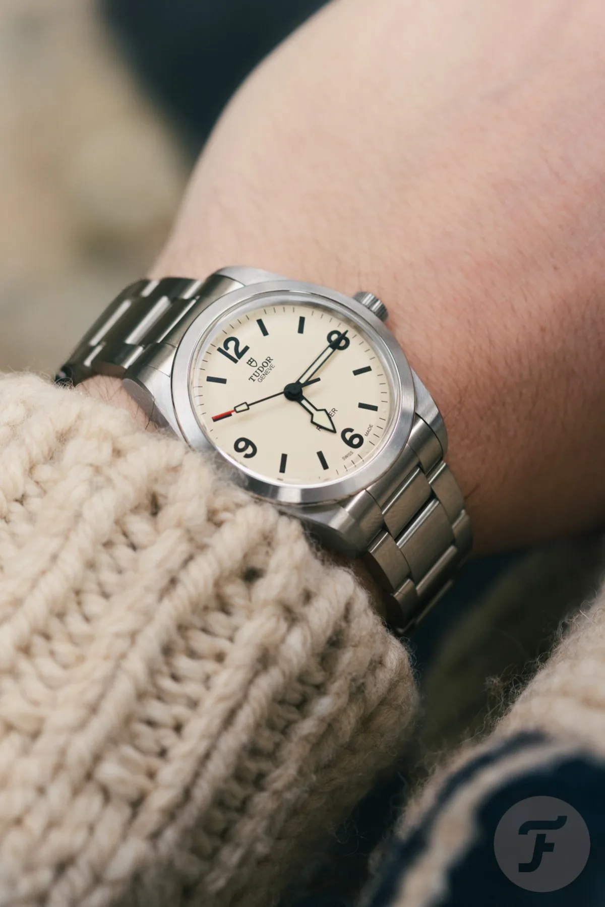
The Tudor Ranger 39mm model was already popular, and recently the brand added a 36mm option, bringing the watch closer to the classic Rolex Explorer style. The original Tudor Ranger was even smaller - 34mm Oyster case. Nevertheless, the release of the 36mm version is a successful decision.
My wrist is 18cm (7.1 inches), and both versions fit perfectly. Judging by how various staff members in the office tried on the watches, almost anyone can find a suitable size, except for those with very thin or large forearms. The main difference is in the feel.
Visual and Tactile Perception
The 36mm version resembles the classic Ranger/Explorer more, whereas the 39mm appears and feels like a modern sports watch. The choice depends on personal preferences, and everyone will find the more suitable option for themselves.
Construction and Finish Quality of the Tudor Ranger
I always enjoy the feel of modern Tudor watches in hand. The case is robust and sufficiently heavy, which inspires confidence. This is felt both when handling the crown and especially when wearing the bracelet. Although Tudor bracelets do not reach the level of Rolex, they have a solid weight and smoothness, giving them a sense of reliability and comfort.
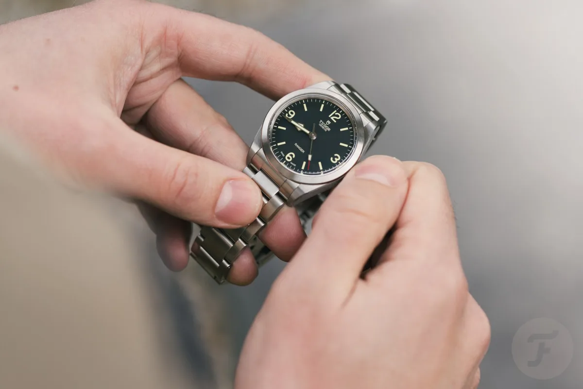
However, questions arise with the finishing of the case and bracelet. The satin finish looks and feels pleasant, with deep and clear texturing, but it has a somewhat rough character. The edge of the case and clasp are too sharp, which could lead to cuts if handled carelessly. While it can be argued that utilitarian Tudor Ranger watches should not have luxury-level finishes, I expect more meticulous workmanship.
Critique of the Typography on the Tudor Ranger Dial
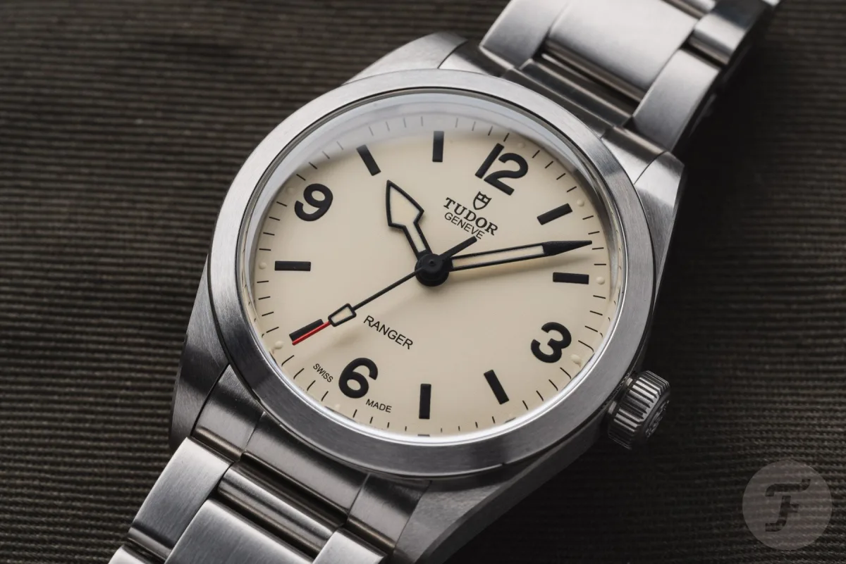
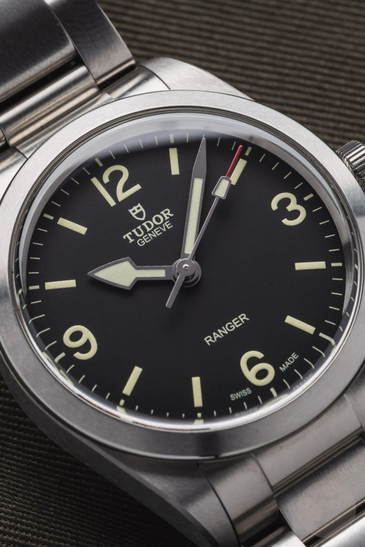
However, the main issue for me is the typography of the dial. From the first glance at the modern Ranger, I felt something was off. The dial seemed unusual. As a fan of classic dials with 3-6-9 markings on the Explorer or vintage Tudor, I decided to consult with watch font expert Samuel Baker. His response was quite enlightening.
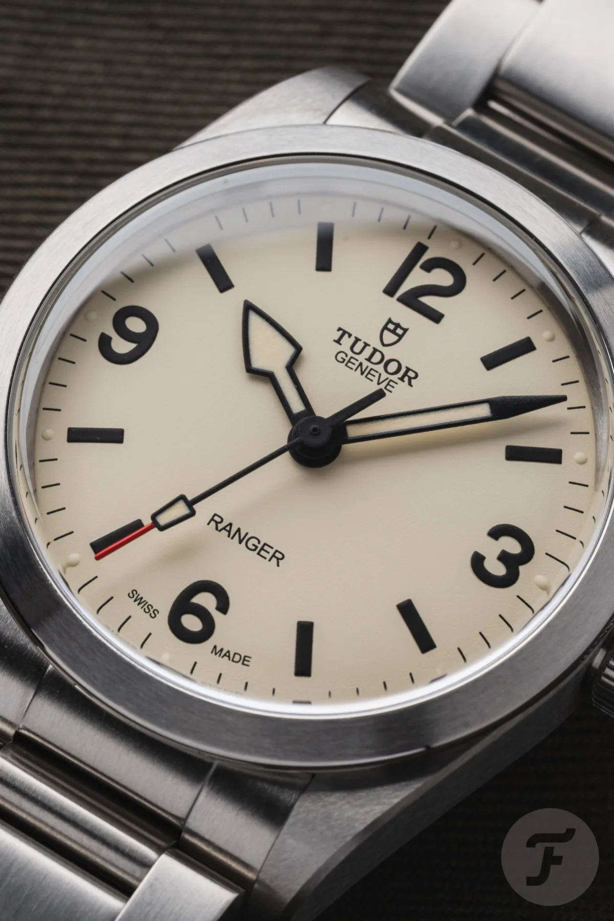
Samuel suggested that the engineers attempted to recreate the style of the vintage Ranger using geometric tools to create curved numbers. This resulted in a fragmented appearance, where curves look awkward and unnatural. The numbers 6 and 9 are almost egg-shaped with overly narrow open sides and broad loops. The number 3 is symmetrical top and bottom, instead of having a wider base and narrow top, creating imbalance. The number 12 violates typographic rules - symbols with curved tops and bottoms are usually visually elongated to appear the same height as straight symbols. Here, the number 1 appears longer than the number 2, which enhances the imbalance.
Furthermore, the inscriptions "Geneve" and "Ranger" are done in a simple Arial font. Compared to the elegant handwritten typography of the original Ranger ref. 7995, this does not seem like progress.
Final Conclusions
The details of finishing and typography are especially important for minimalist and utilitarian watches. They make the watch special, not just basic tools. Although the Tudor Ranger is an "entry-level" model in the Tudor range, I believe more attention should be paid to these aspects. Knowing how passionately Tudor specialists approach watches, I am sure someone has already raised the issue of the unbalanced dial. It's a pity that this voice was not heard.
Nevertheless, the Tudor Ranger remains a reliable and quality watch. They are offered in two harmoniously selected sizes with different stylistic accents. Both versions are comfortable to wear thanks to the excellent bracelet. Dial issues are unlikely to be critical for most buyers. WatchTested's publication is aimed at enthusiasts, and if there's a place to discuss such nuances, it's here.
In the end, despite some flaws, the Tudor Ranger is a good watch. What is your opinion? Share in the comments.