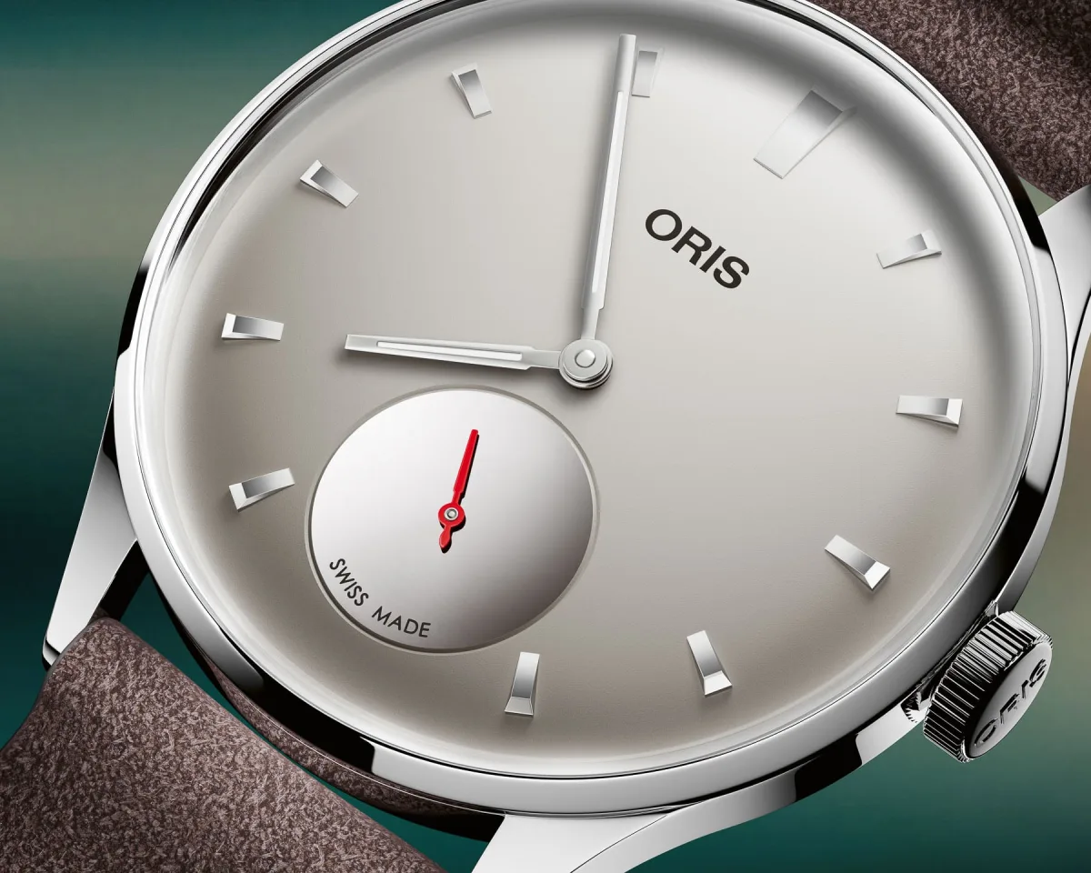
There's a particular kind of disappointment that arises when encountering a watch on a brand's website, and you feel absolutely nothing.
The dial is clear, the case shines, the lugs are impeccably geometric. Yet, you close the tab without any impression. You have just fallen victim to a render. It looked decent, certainly, but left no trace, and you simply moved on to something else.
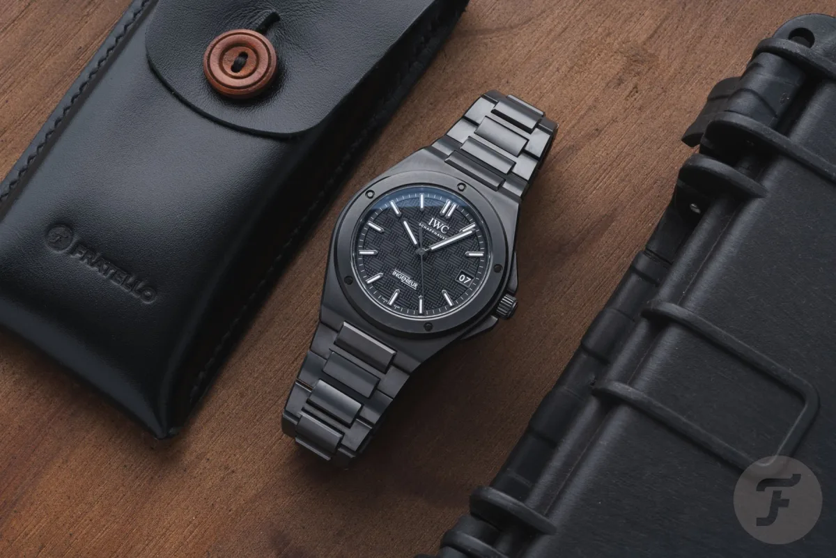
Then, weeks later, you see the same watch photographed by a colleague in natural light or, better yet, on someone's wrist in real life, and something changes. The dial gains texture, the case acquires character, and the finish plays with light in a way that makes you inadvertently give a compliment. The watch, which you mentally categorized as 'indifferent', suddenly captures all your attention. This is the render trap, and the watch industry regularly falls into it.
The Render Trap
Our founder recently encountered it with the Oris Artelier Hölstein Edition 2026. First presented on June 1st using renders, the watch left him indifferent. What interested him was not the visualization, but the press release detailing the Bauhaus-inspired design, signature caliber 401, and 10-year warranty.
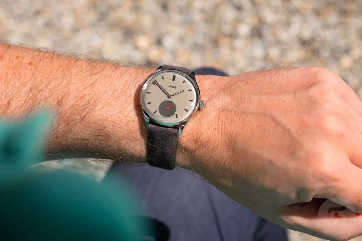
When the watch arrived at the office, the situation changed. The highly polished case and convex gray dial, which seemed flat and featureless in CGI images, appeared entirely different in person.
Much Better in Real Life
These watches are difficult to photograph - an important observation. Their real-life appeal lies in the details that are hard to convey digitally: the play of light on the polished sub-dial at the '6 o'clock' position, the contrast between matte and polished surfaces, the smooth dome of the dial echoing the contours of the case and glass. These are dynamic, three-dimensional phenomena. Renders reduce them to one moment chosen by the software.
Reality shows everything simultaneously, constantly changing with wrist movement. The suede strap also fell victim to the render. It was described as much softer and more expressive than expected from computer images. Its dark gray-brown shade complemented the light gray dial perfectly - something renders failed to convey at all. This is not a unique experience but one of the defining phenomena of modern watch journalism. How many articles on WatchTested started with 'We were skeptical about the renders, but when we held the watch in our hands…'? The number of such materials is alarmingly large, and rarely are the watches themselves to blame.

What a Render Can and Cannot Show
A CGI render is, in principle, quite a reasonable tool. Before production begins, watches often do not exist in physical form. Renders allow brands to showcase a concept, intrigue with design, and start building interest. It's like architectural drawings presented as a finished building. The problem is that watches, unlike most architectural projects, live and die by the quality of physical execution - and this is what renders cannot convey.
Think about what happens with reflections when light falls on a polished case in real life. Reflections constantly change.
A matte surface absorbs and redirects light, creating a fluctuating contrast with the polished beveled edge, and this relationship changes every second with wrist movement. A render captures one lighting scenario, usually a studio setup programmed to make the watch look clean and readable. It cannot replicate the dynamic interaction of light with finely finished metal - often the very point of high costs.
Texture Almost Impossible to Convey in a Render
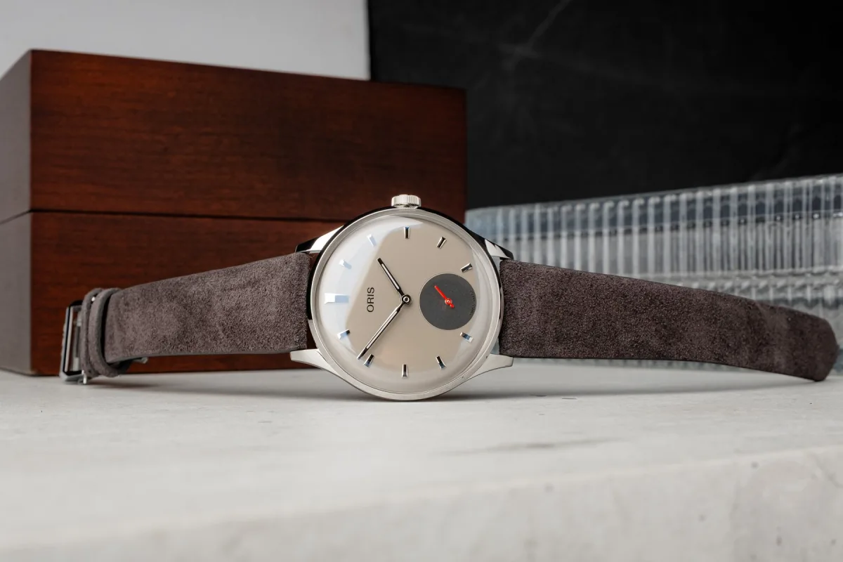
The dial's texture is another victim of the render. The domed gray dial of the Artelier Hölstein Edition looks like a pleasant but neutral surface in the render. In real life, it echoes the curve of the sapphire glass. Applied and faceted hour markers catch light at angles that CGI simply did not detect, and the polished sub-dial creates a stunning contrast effect that cannot be conveyed through computer images. Sunburst or guilloché dials suffer similarly. On screen, they show a gradient from light to dark, while in reality, it's a physical structure that seems to breathe depending on the viewing angle and surrounding light. Proportions are the third element that watch renders systematically distort or fail to show at all.
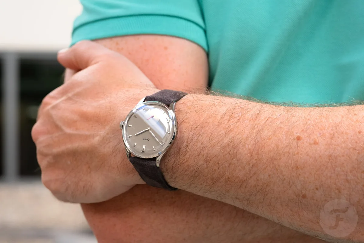
A render on a white background provides abstract numerical values for diameter and lug-to-lug distance. It gives no context for the case on the wrist, the thin profile under a shirt cuff, or the curvature of the lugs fitting snugly against the skin. Oris perfectly selected the proportions for the Hölstein Edition, and the thin profile matches the diameter beautifully. Such a judgment can only be made when trying it on. A render won't tell.
Arguments for Real Photography
That's why a good review photograph does what renders fundamentally cannot: it introduces an element of truth. When professional photographers shoot watches in natural light or in a carefully thought-out setting that mimics real wearing conditions, they translate three-dimensional objects with dynamic visual properties into two-dimensional images. This is by nature a loss process. But these are honest losses. The image shows what the watch actually looks like, with all its features and qualities. The dial's texture is present. The case bevels play with light just as they do in life. If the finish is imperfect, a good photograph will reveal it, which a render, controlled in every pixel, will never do.

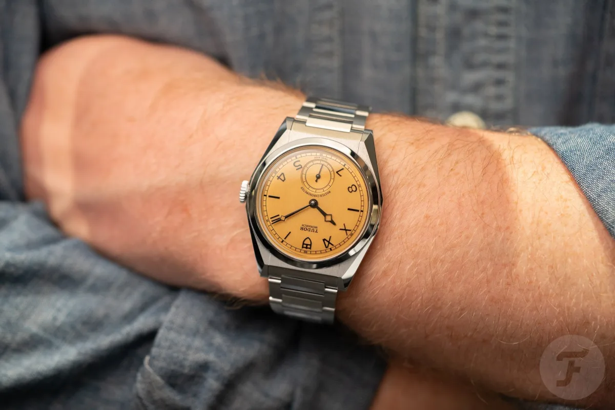
Context also matters greatly. The best review shots show the watch on the wrist, on the table, in the natural light of an ordinary Tuesday. These images allow the viewer to make an act of imagination - to picture themselves in the moment and understand if these watches suit them. Renders ask you to admire technical specifications. Photography invites a relationship. Shots with sunlight on the wrist for the Artelier Hölstein Edition, reflections on glass and strap on the skin tell more about the watch than any initial renders. The gap between CGI and real photos is the difference between reading a menu and smelling the food at the next table. One says what it is, the other makes you want it.
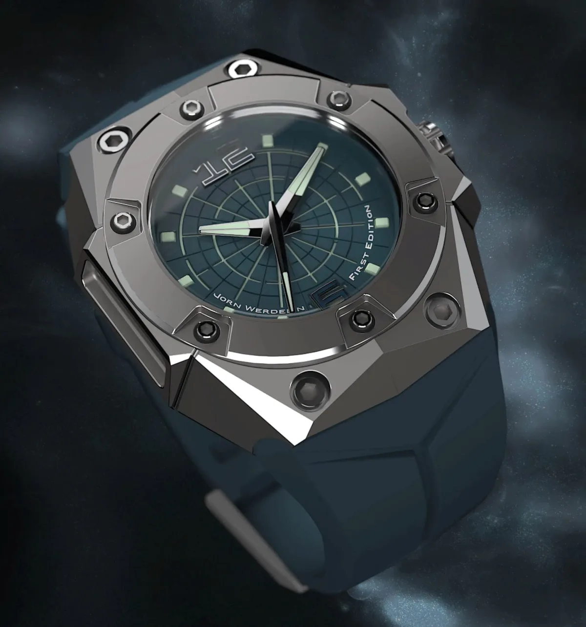
Why Do Brands Continue to Use Renders?
The answer is almost certainly in the timing. Renders exist because marketing and production calendars do not align. By the time of the announcement, physical samples are often not ready in sufficient quantity for shooting and distribution among journalists. Renders fill this gap. They allow brands to create buzz, launch social media campaigns, and gain press coverage before a single sample has been approved at the factory. There's also the matter of control. A render is perfect as opposed to reality. Lighting is perfect, the finish is flawless, the background is impeccable. It's easier for brands to manage visual identity through pixel-controlled images. Real photography introduces variables: the photographer's interpretation, natural imperfections of the product, the possibility that the lens will show what the marketer would prefer to hide.
But here's the point: if watches look worse in real photographs than in renders, that's critical product information, and concealing it serves neither the clients nor the brand. Buyers disappointed after purchasing based on a render are unlikely to become loyal customers. Those who see honest photographs, fall in love with the watches, and receive a product that meets or exceeds expectations will remain. In the case of Oris, the situation is the opposite: the renders underestimated the genuinely attractive watch. Oris did itself a disservice by not presenting real photos at the launch. That's putting it mildly. When watches look dull in initial images, the brand effectively works against its sales.
What First-Hand Review Provides
Partly why first-hand reviews remain the cornerstone of WatchTested's work and are more important than ever. Renders show the best, most controlled, and least informative version of a watch presentation, while a first-hand review tells how they are actually worn.
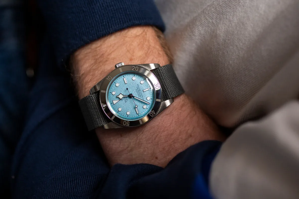
When authors spend time with watches, noticing how the strap softens over a few days, how polished elements sparkle at dinner, and how comfortably the thin case tucks under a cuff, they accumulate honest experience that no software can create. Photographs taken in such a context are the closest most enthusiasts will get to reality, short of visiting an authorized dealer and trying them on. This is, in general, the gold standard. No image - neither render nor photo - can replace that.

Final Thoughts: A Call to the Industry
The watch industry exquisitely values craftsmanship. Brands spend years perfecting a mechanism, countless hours hand-beveling bridges, and significant resources developing new dial finishes or case alloys. And then they present the result to the world through software that reduces all that craftsmanship to a clean, lifeless, emotionally inert image. It's a strange discrepancy that does more harm to excellent watches than brands realize.
The Oris Artelier Hölstein Edition 2026 is neither the first nor the last victim of this phenomenon. We've seen it in tool watches whose brushing in CGI looked flat but impressive in real life. We see it constantly. So here's an appeal to all watch brands: invest in real photography at launch, even if it means waiting longer, even if it means releasing fewer images but more honest ones. Find ways to get production samples or late pre-production units to photographers who know how to light watches. Your renders are technically perfect, but they tell the wrong story. Your watches deserve better, as do the people who might want to buy them.