The first time I saw Qian GuoBiao watches in person was this model - the Split-Seconds Chronograph.
Previously, I hadn't had the chance to see his works up close: neither at exhibitions where watches are usually behind glass nor at collector events. For a long time, I admired Master Qian's creations through a laptop screen, but this encounter with his chronograph was my first real experience interacting with his watches.
This context is important. Master Qian's watches are not items you can fully appreciate at first glance. They require time, curiosity, and a desire to understand not only the aesthetics but also the mechanics. Upon seeing and wearing the split-seconds chronograph, I immediately realized: these are watches designed for everyday wear and active use, not for passive gazing through a screen.
Color, Character, and Design
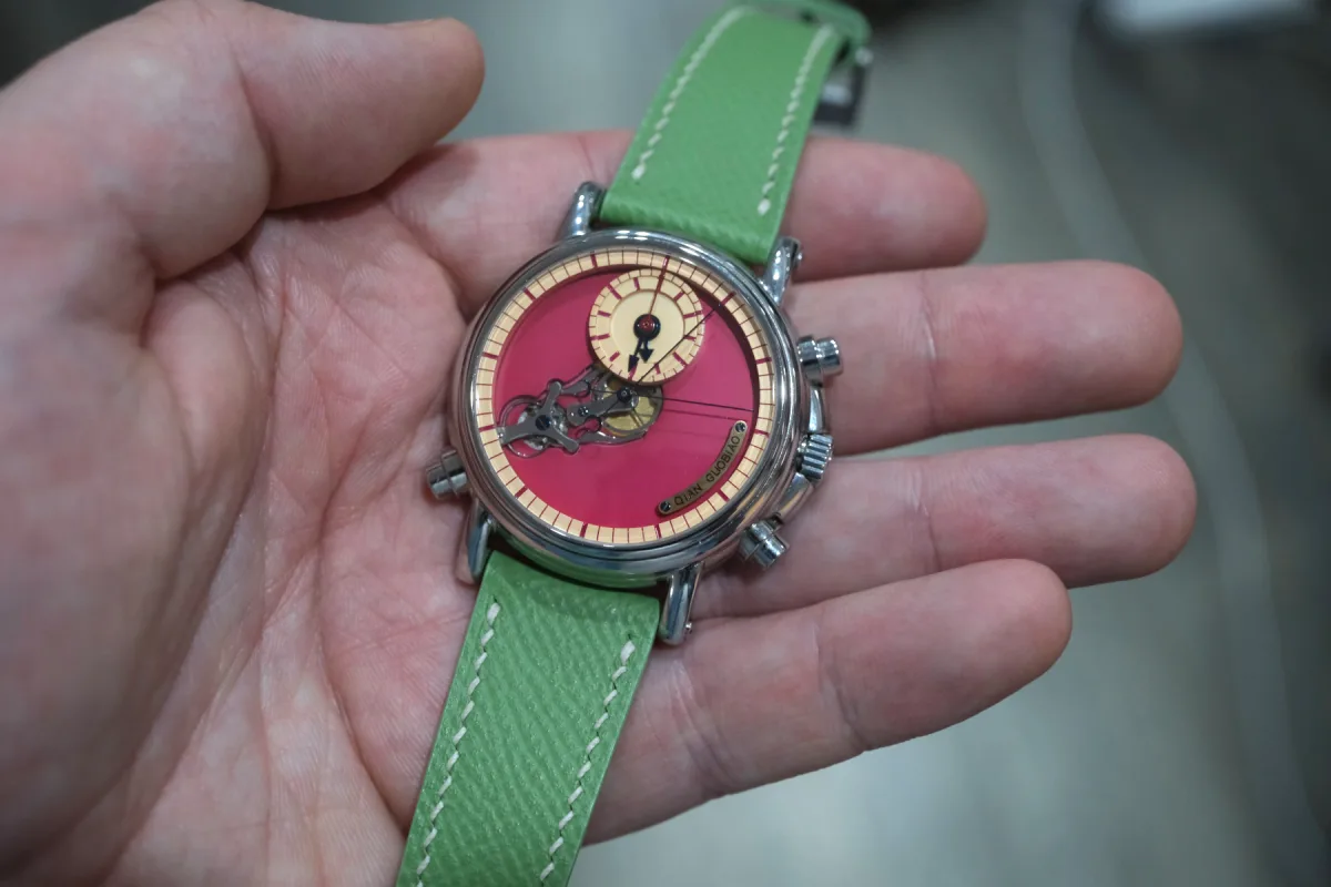
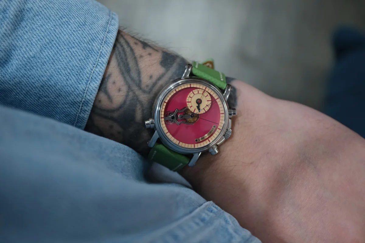
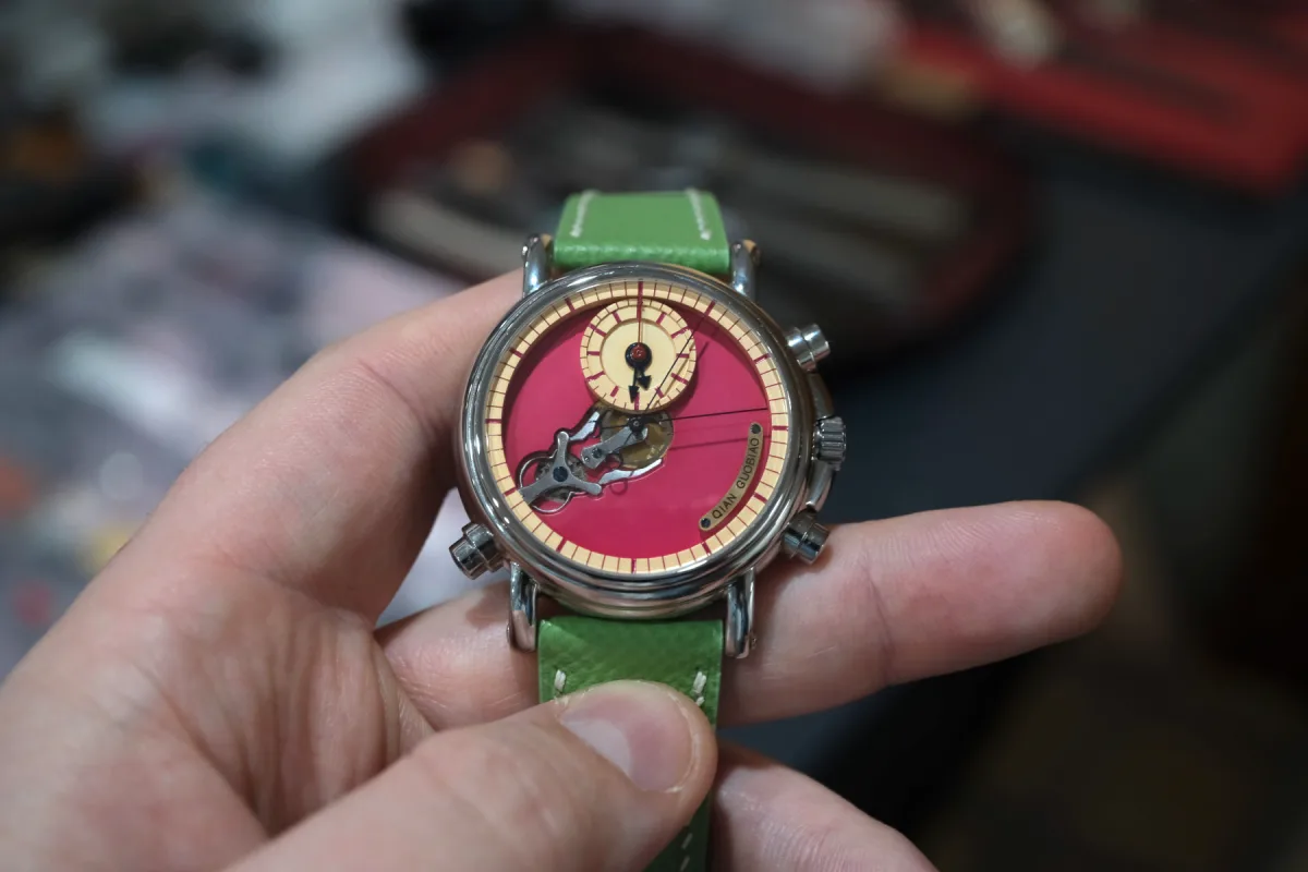
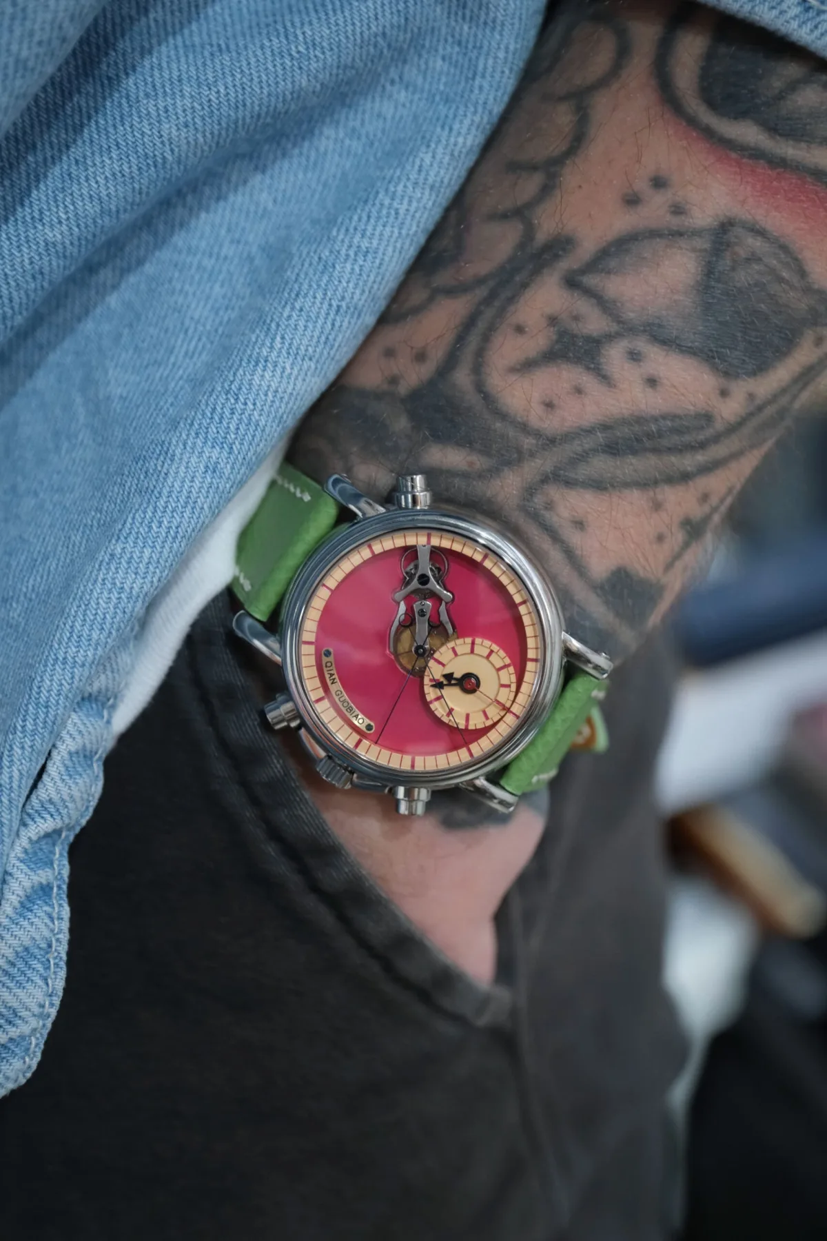
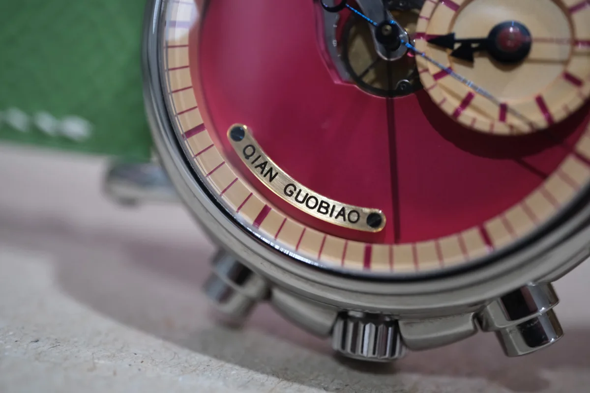
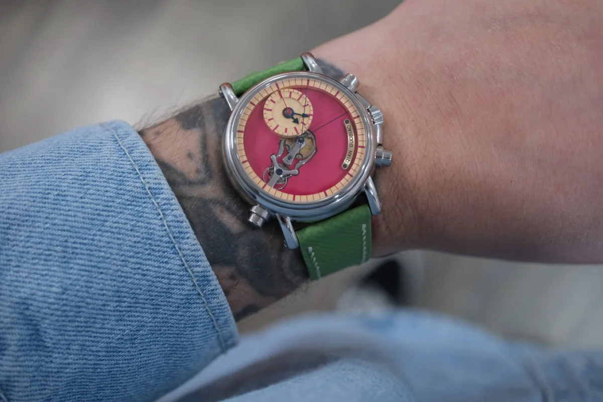
The first thing that catches your eye is the color scheme. On paper, the rich red-purple dial combined with pale yellow scales and a green strap seems almost provocative. Without personally experiencing this combination, one might wonder: "Who would choose such bold colors?" It's a fair question. This set is dramatically different from the restrained, monochrome palette that fans of Qian's work are accustomed to.
However, in person, everything falls into place. The colors look confident, not loud, expressive, not chaotic. Contrary to logic, this combination works. Moreover, it creates an astonishingly harmonious image. It feels as though Qian allowed himself a bit of freedom and even playfulness, without diminishing the seriousness of the watch. The dial doesn't seem decorative for the sake of decoration - color is used to structure space, separate functions, and guide the eye.
The main focus remains on the mechanics. Color only frames it, giving the chronograph a different emotional tone without disrupting the continuity of the master's creative style.
Wearing the Split-Seconds Chronograph
The stainless steel case with a diameter of 40 mm and a thickness of 14.5 mm is a very comfortable size for a watch with such complex mechanics. On paper, the dimensions suggest a significant presence, but on the wrist, the watch feels balanced and well-thought-out. The proportions are harmonious, aided by the 47.7 mm lug-to-lug length - everything is under control.
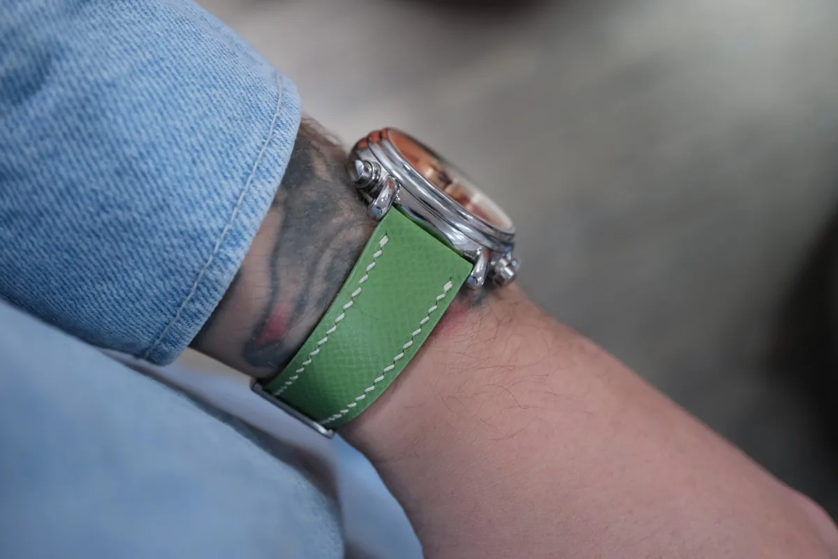
The inverted pump pushers are particularly pleasant. They nod to traditional chronograph design but don't look retro, and their placement makes operating the chronograph intuitive. The watch feels reliable, not fragile or overly delicate, encouraging you to use the complication as intended, rather than just admire it. Considering the cutout on the dial revealing the rattrapante clutch, you will want to do this often.
Mechanism in Action
It is when the split-seconds chronograph is in action that the watch fully reveals itself. Watching the claw-type clutch at work never gets old, and the split-seconds system is mesmerizing. It's not just a complication you know about - you feel it with every press of a button. That's the essence of a chronograph. I believe every chronograph owner enjoys using it, sometimes just for the fun of it. But when you see what's happening inside, the magic becomes more tangible.
Qian has always managed to make the special features of his watches visible on the dial, and this model goes further than anything I've seen from him before. Interestingly, it was initially planned to place the hour and minute hands in the center of the dial, like in traditional chronographs. But it quickly became clear that this would dilute the uniqueness of the model. The claw clutch mechanism - the heart of the split-seconds function - deserved more space and attention.
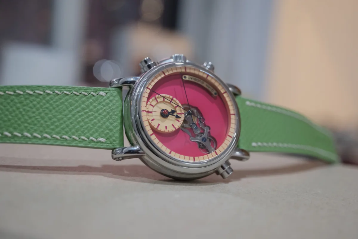
Shifting the Time to the 12 o'clock Position
The solution was to move the time display and the 30-minute counter to the 12 o'clock position. This allowed the split-seconds hands and the clutch system to become the main visual and mechanical elements. This decision seems obvious when looking at the watch in person, but behind the scenes, it was a complex task. It required recalibrating the gear transmission of the auxiliary dials and even modifying the bridge construction of the main plate mechanism - not an easy feat.
Nevertheless, moving the time to 12 o'clock proved to be the right choice. Readability was maintained, and the chronograph mechanism remained the focal point. Nothing was compromised, the dial looks meticulously thought out, and every detail is in its place.
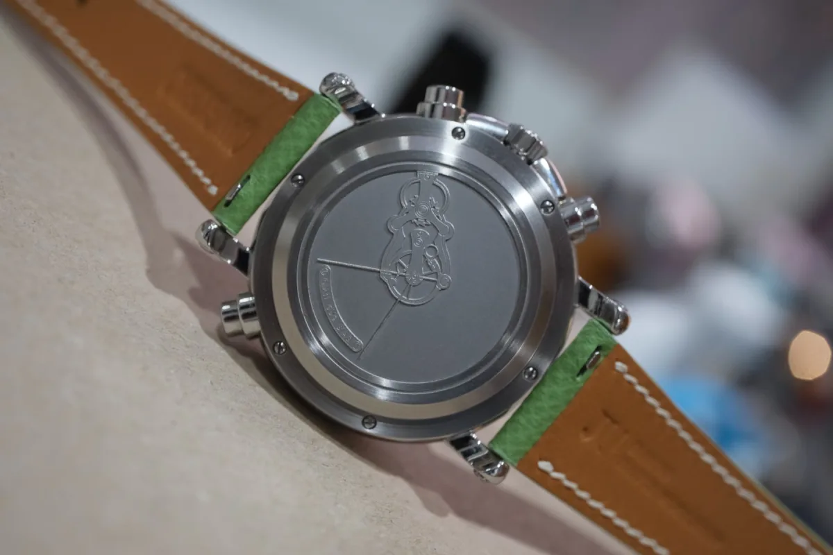
Using the ETA Base, but Not as Usual
When you flip the watch over, you see the solid metal case back, which may raise questions. In reality, it's justified. Inside is a heavily modified ETA base. And while the ETA itself is not criticized, the main story of these watches happens on the front side.
This is not "just ETA" in the usual sense. The rattrapante system, layout, and visual identity of the mechanism are entirely the master's original developments. The modifications are so extensive that the emphasis on the front side is an honest acknowledgment, not an attempt to hide something.
Value, Rarity, and Positioning
The price of 29,000 Swiss francs places the chronograph in an interesting position. It is significantly more accessible than some of Master Qian's previous models, yet remains one of his most technically ambitious works. This becomes more apparent the longer you interact with it.
Production is limited to only five pieces in this color scheme. Whether other versions will be released is unknown, but five pieces is a very small run. Nonetheless, it's a rarity with substance, not just a marketing ploy. I don't think these watches will take long to find their owners. Master Qian's works are in high demand, and I congratulate their new owners in advance. I would very much like to be one of them.
Final Impressions of the Qian GuoBiao Chronograph
Limited time with the Qian GuoBiao chronograph left a strong impression. These are technically serious, visually appealing, and deeply satisfying watches to interact with. They feel like an evolution in the master's work - not a departure from tradition, but a loosening of the reins. Although I liked previous releases such as Facing The Sky 2.0 and Double Balance Wheel, this model created a more personal connection for me. Without a doubt, these are watches for me. It also seems that Qian is beginning to find his rhythm and understanding of what his brand truly represents. After all, he started by creating single prototypes for pleasure, not commerce.
Here, there is a sense of confidence, a willingness to experiment with color and character without sacrificing rigor and intent. For me, it was a truly eye-opening experience with Master Qian's watches. If this chronograph is an indicator of the direction of his creativity, the future seems even more exciting.