In an era when luxury brands often lose restraint in their quest for visibility, there is something profoundly alluring about a watch dial that says... nothing.
Only form, texture, proportions, and confidence. Increasingly, some of the world's most progressive watchmakers are concluding that the highest level of style is silence. This is an intriguing shift compared to the long-standing tradition of bold branding.
Historical Context: The Dial as Advertising Space
The dial has always been a key platform for brands - a kind of miniature billboard. Every manufacturer sought to place its name in the spotlight, often adding model names, water resistance, movement features, and other details reminiscent of pharmaceutical warnings. The luxury watch boom at the end of the 20th century only heightened this trend. Branding became louder as consumers were taught to desire recognition. However, today true elegance manifests differently. Modern enthusiasts value restraint more than declarations. Tastes have shifted from overt signals of luxury to subtle signs of recognition, understood only by the initiated. Nowhere is this philosophy more gracefully expressed than in watches that dare to leave their dials devoid of logos.
Benrus Type 1 Mil Spec - A Modern Symbol of Minimalism
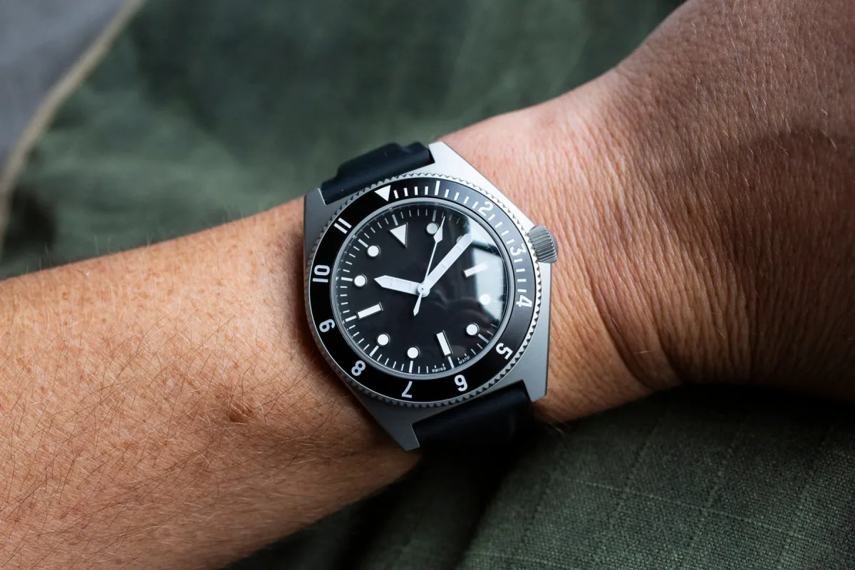
For me, this idea took shape in the modern Benrus Type 1 Mil Spec. Originally designed in the 1970s for elite U.S. military units, these watches were not intended for luxury, collecting, or even attracting attention. They were a tool in the purest sense. A sterile dial was part of the technical specification. Branding was considered superfluous and even undesirable in combat conditions. The watches existed solely to fulfill their function.
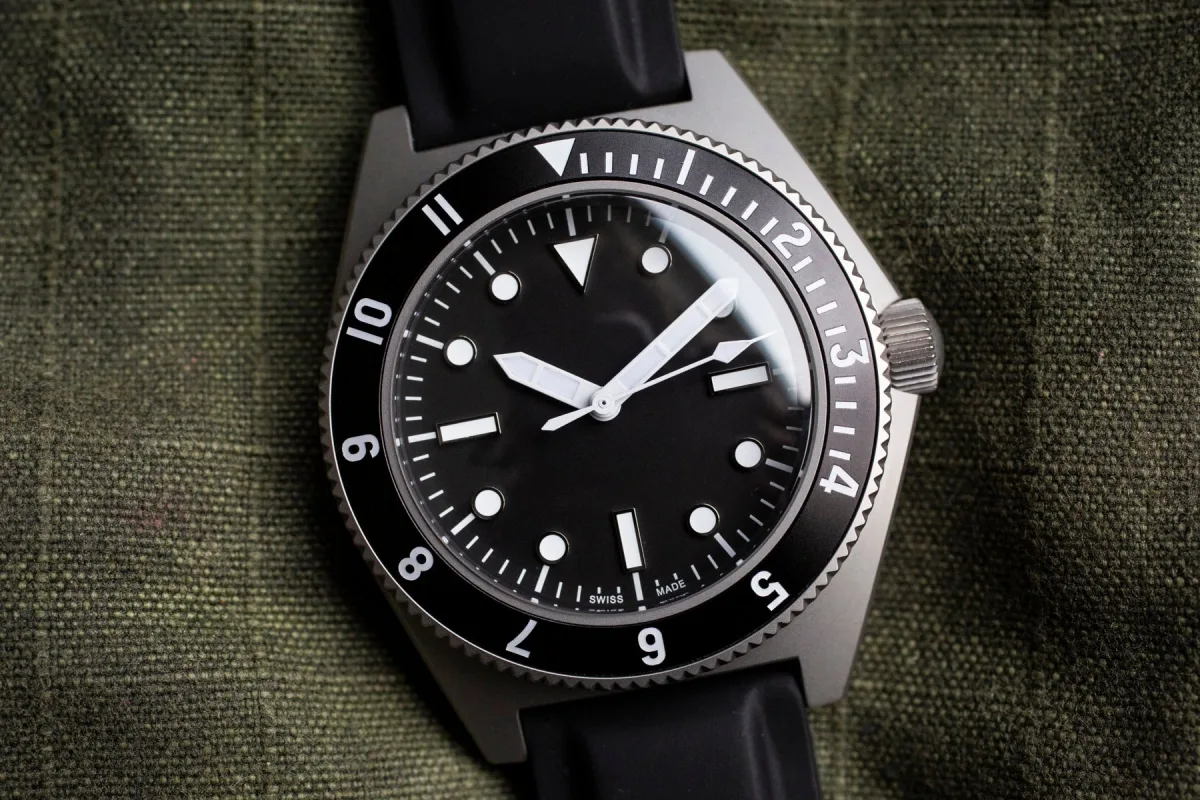
The modern version conveys this spirit brilliantly. Wearing the Type 1 Mil Spec initially feels almost shocking - the absence of a logo creates a sense of visual calm. The eye naturally focuses on the dial's geometry, matte black surface, clear markers, and balanced hands. Nothing distracts.
Everything Reduced to Essence
There are no imprints from marketing departments, no attempts to convince of the model's importance. The irony is that this very restraint gives the watch a special status. The modern luxury buyer is acutely aware of desperation. Overloaded designs, excessively large logos, and aggressive branding increasingly signal not prestige but insecurity. In contrast, a sterile dial radiates the highest degree of confidence. It speaks of a brand strong enough to step into the product's shadow. This is why the Type 1 is so relevant in 2026.
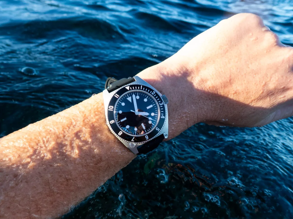
This is not just a reproduction of military watches - it is a reproduction of a certain attitude. They seem almost anti-commercial in the best sense. You might wear them for months, and no one will notice. But if someone does, it's likely a person worth starting a conversation with. Here, silent dials intersect with modern ideas of taste. The appeal lies not in anonymity for its own sake but in selective recognition. Sterile watches become a kind of whisper for the initiated. The irony is that the refusal of branding itself becomes a complex form of branding.
Design Choices and Brand Philosophy
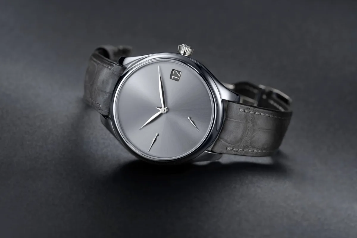
Few understand this better than H. Moser & Cie. Over the past decade, Moser has positioned itself as a provocateur in the luxury world, mocking excesses while perfecting them. Their "Concept" watches, completely devoid of logos and indices, are some of the most expressive examples of modern watch aesthetics. By often removing the logo from the dial (though not always), Moser turns recognizability into a matter of subtle taste. "If you know, you know." If not, the watch is simply beautiful.
This is an important distinction, as true confidence in luxury does not require recognition from everyone. Moser's approach reflects a broader cultural trend. In fashion, design, and architecture, quiet luxury has replaced conspicuous consumption as a dominant aesthetic goal. We have moved from the maximalism of the 2000s to a more refined and confidently restrained style. In watchmaking, sterile and logo-free dials are the purest expression of this evolution. But the appeal of such an approach is not limited to tactical models or expensive independent brands. AnOrdain offers another take on this idea.
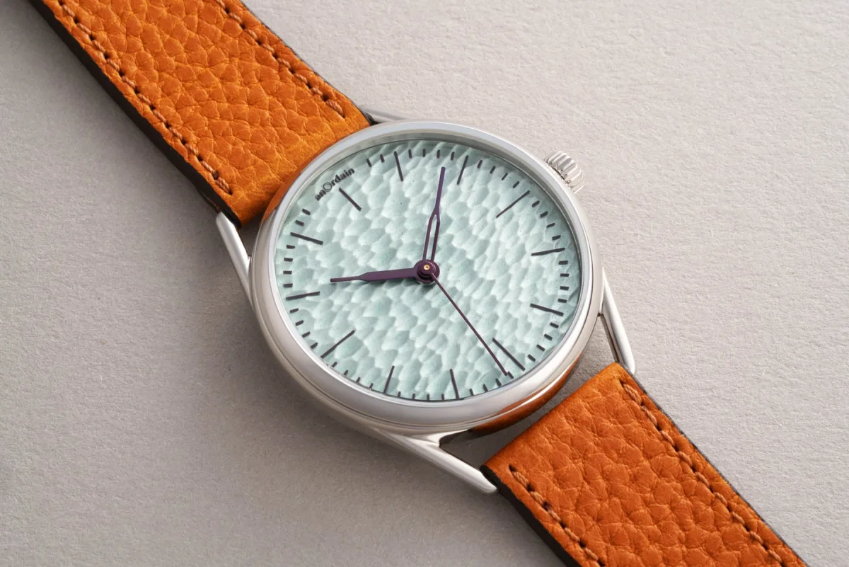
Scottish Dream: Uniqueness of AnOrdain Enamel Dials
The enamel dials of the Scottish manufacturer are among the most recognizable in modern watchmaking, shining with the depth and color of handmade craftsmanship. Many brands would instinctively place large logos on such dials to enhance identity. AnOrdain wisely resists this urge. Restrained typography and sometimes almost complete absence of branding allow the craftsmanship to speak for itself. This restraint is important as enamel possesses emotional depth that is easily disrupted.
Every extra line of text becomes an obstacle. In AnOrdain watches, the dial often seems almost meditative due to its visual purity. The same philosophy explains why vintage military watches remain such sought-after style icons. Their appeal is largely linked to authenticity. These watches were not created for marketing identity. They were created to dissolve into function.
Modern Collectors and the Value of Honesty
Modern collectors crave this honesty because modern luxury products are often excessively subject to media reflection. We are immersed in stories, legacy campaigns, ambassador projects, and algorithmic branding strategies. A sterile dial cuts through all this with striking directness: "This is a watch, and nothing more."
Interestingly, removing the logo can enhance emotional connection with the object. Without branding as a visual crutch, the owner begins to notice other details: the texture of the surface, the proportions of the markers, the negative space, the play of light and shadow. The watch ceases to be a corporate symbol and becomes an object of industrial design.
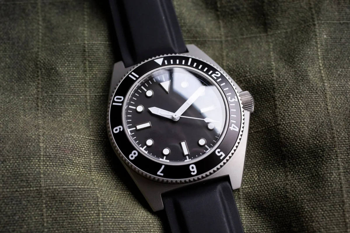
Wearing Experience: Benrus Type 1 Mil Spec
The Benrus Type 1 Mil Spec illustrates this perfectly. While wearing it, I began to notice details I might otherwise have missed: the sharpness of the bezel edge, the softness of the case's satin finish, the clarity of the asymmetrical marker arrangement. The absence of a logo at the "12 o'clock" position gives the eye the freedom to explore the dial. This creates an almost paradoxical intimacy.
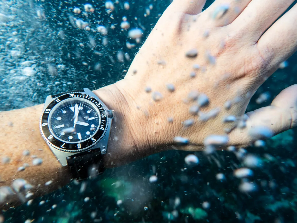
The watch feels not like a branded product but as a personal item. There is also an undeniably rebellious spirit in logo-free watches in the age of social media. We live in times of constant visibility, where products are chosen for their recognizability on a smartphone screen. Sterile watches completely reject this logic, and this counterculture (can it be called anti-hype?) may become a new aim for emulation (one would hope). Of course, not every brand can achieve this. Minimalism without a deep design concept quickly turns into emptiness. A sterile dial works only when the proportions, finish, and visual language are strong enough to compensate for the lack of text. Otherwise, the watch looks unfinished.
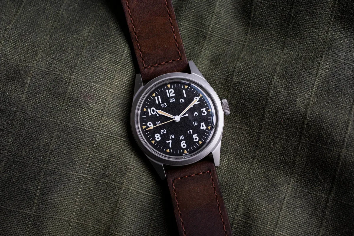
Should More Brands Remove Their Names from Dials?
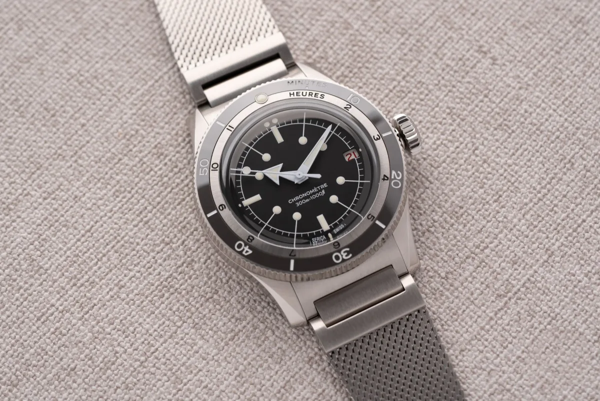
This is why brands like Benrus, Moser, AnOrdain, and Serica succeed. Each has a clear aesthetic identity independent of logos. You recognize the watches by shape, texture, and atmosphere, not typography. In many ways, this is the highest level of brand achievement. A hundred years ago, logos on dials served practical functions: mass production was growing, and companies needed recognizability and differentiation. Today, the strongest brands are often able to completely abandon explicit identification.
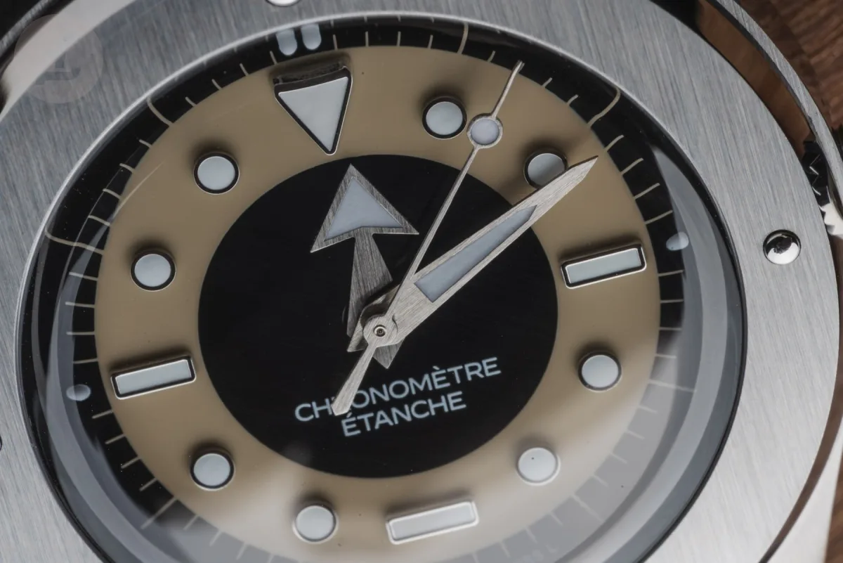
An example from car design - a Porsche 911 is recognizable from afar without the manufacturer's emblem. The same principle applies here. The highest degree of style is when a product doesn't need self-promotion. Perhaps this is why sterile dials resonate so much today. They reflect the maturity of brands and collectors. They come from confidence, not insecurity. They reward observation, not the pursuit of attention.
And most importantly, they remind us that watches are, first and foremost, visual objects. Before brand stories, investment considerations, and Instagram status display, watches live or die by how they look and feel on the wrist. Remove the logos, and this truth becomes impossible to ignore.
Concluding Thoughts
Amazingly, what began as military pragmatism has turned into the purest expression of modern luxury. In an industry accustomed to saying much, the most stylish watches increasingly understand the value of silence.
What do you think? I would be glad to read your thoughts in the comments.